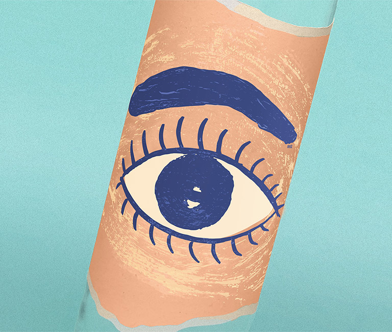
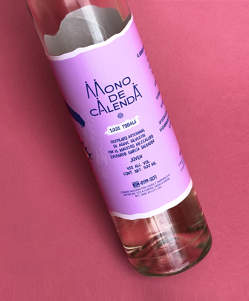
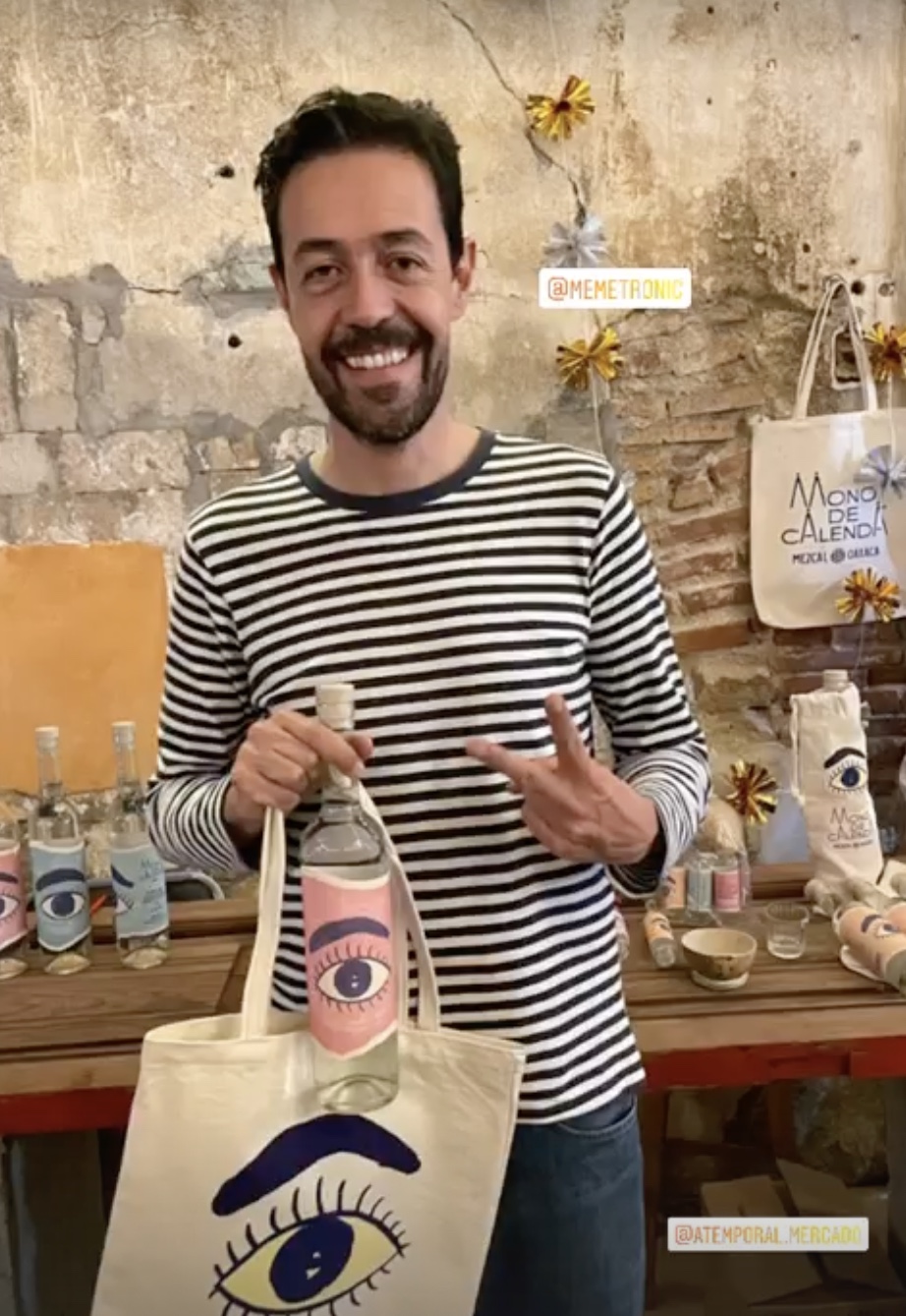
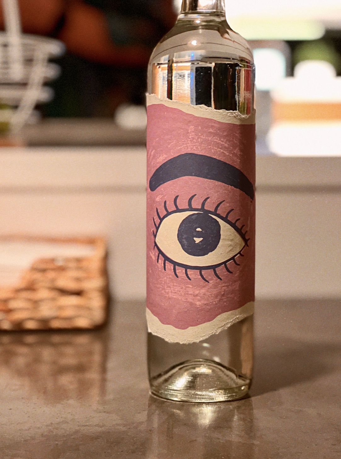
Mono de Calenda
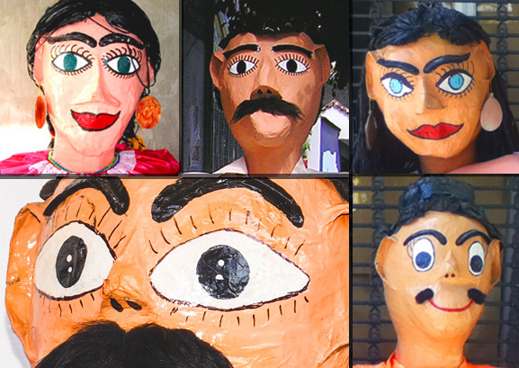
Witness a parade going down the streets of Oaxaca, and you will see ‘monos de calenda,’ giant paper mache puppets with painted faces, dancing above everyone else.
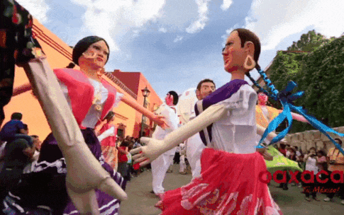
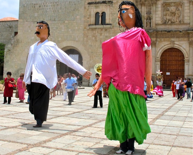
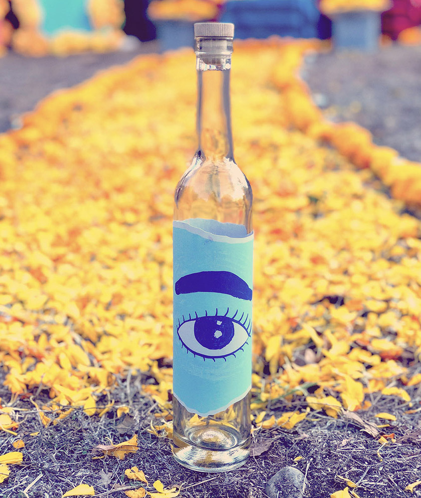
Back when the Spanish arrived hundreds of years ago, two Oaxacan traditions were born: these monos, and mezcal.
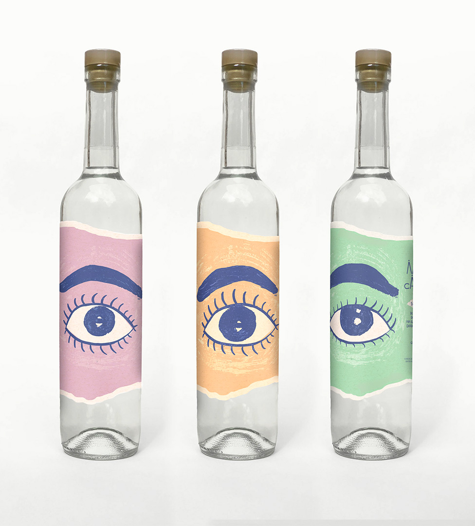
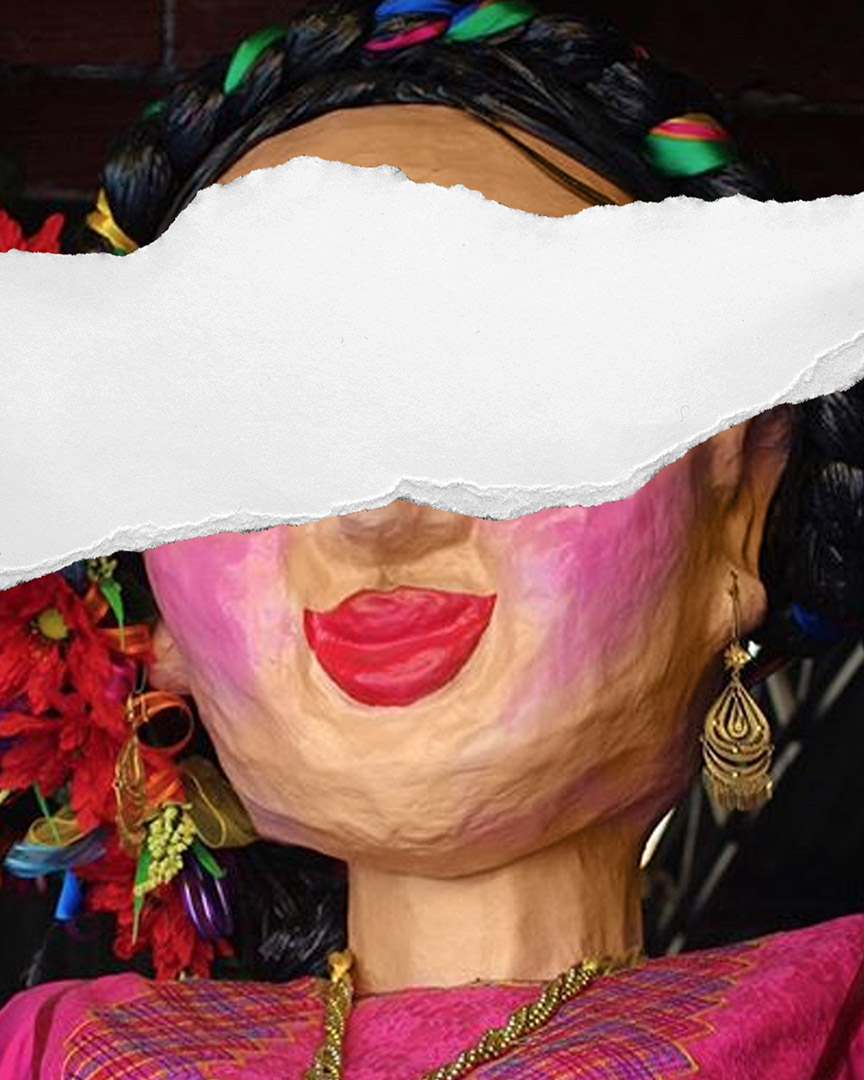
They inspire the name of this mezcal, and the packaging design imagines tearing off the paper mache and wrapping it around the bottle.
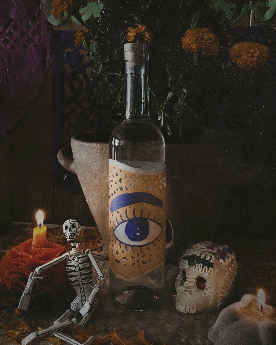
Limited Edition bottle for Día de Muertos
Using just the eye, we capture the soul of the mono de calenda, and, create a powerful symbol. It’s our swoosh. A logo that stares at you from behind the bar.
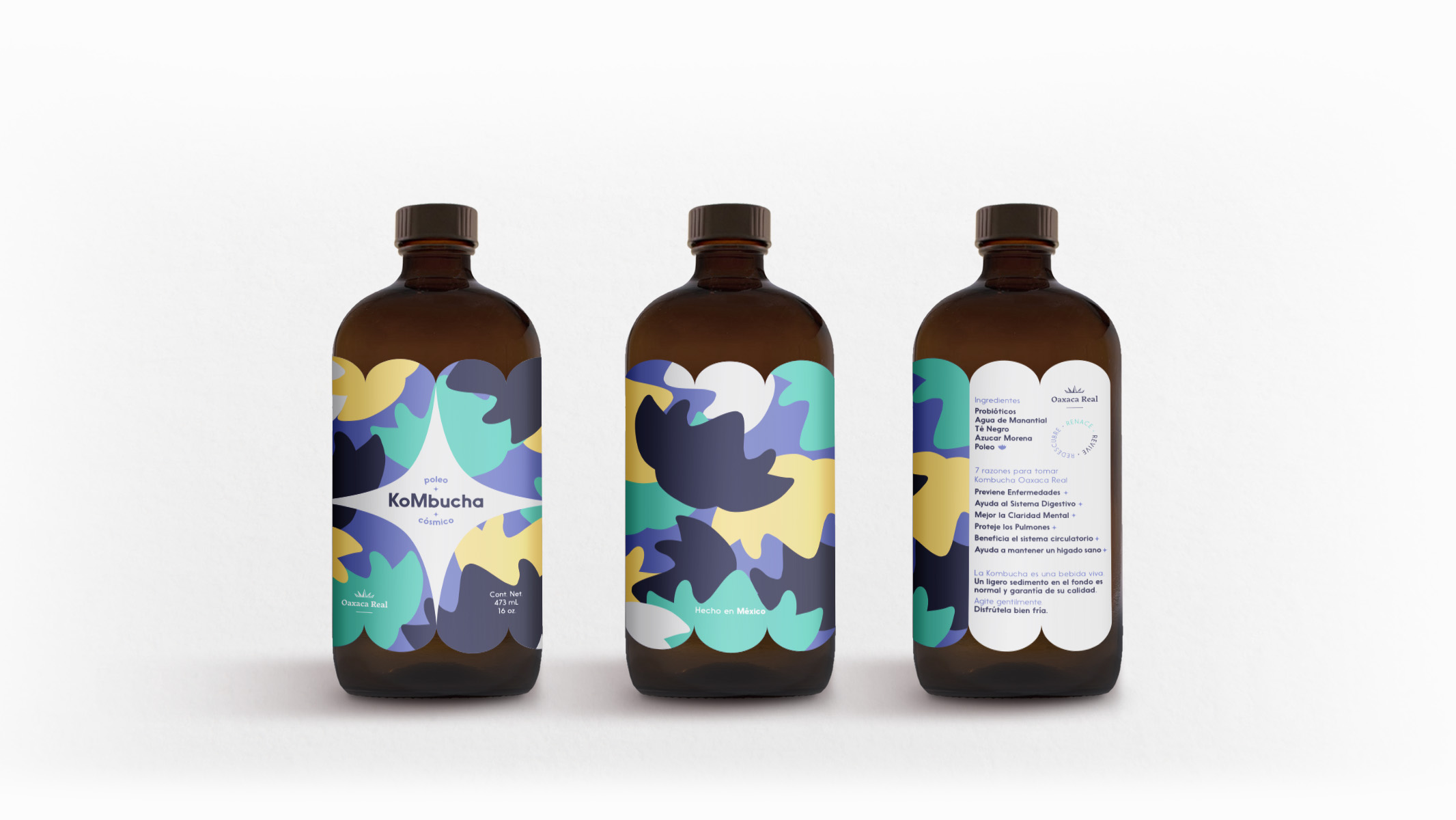
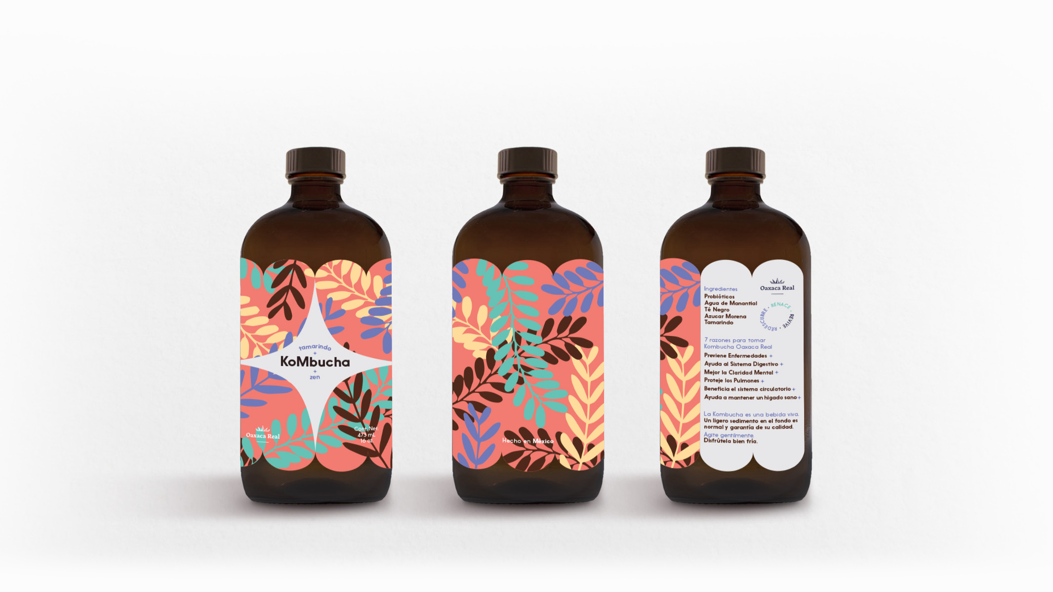
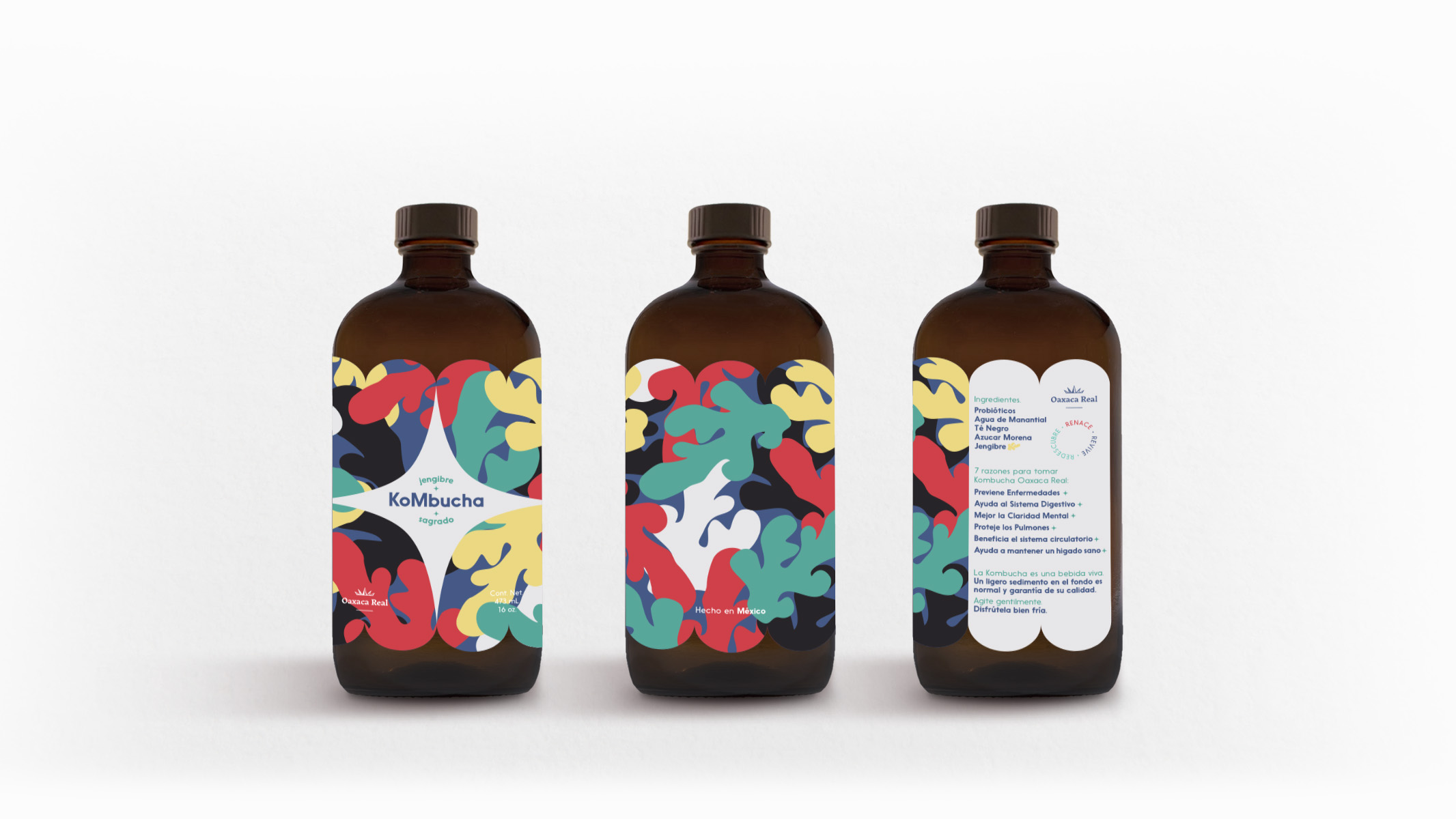
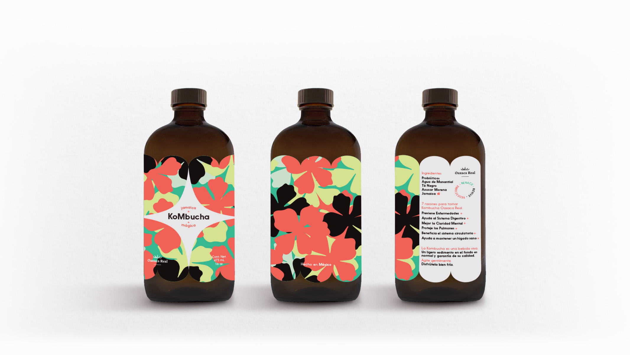
Oaxaca Real
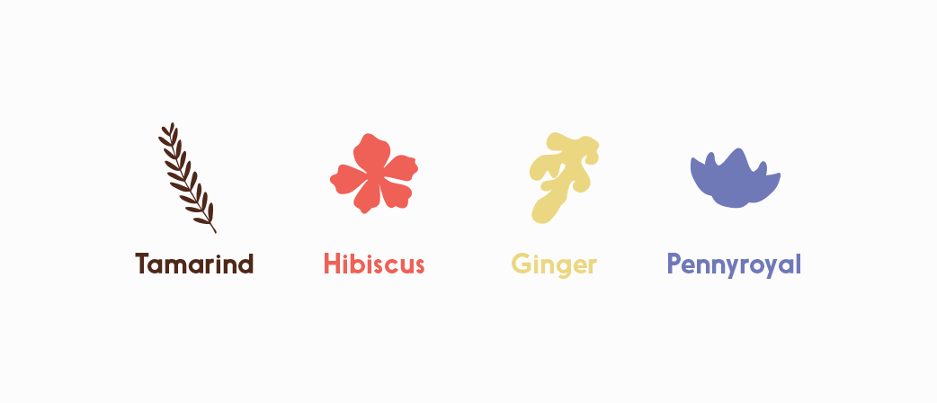
The natural ingredient that flavors each bottle, also patterns itself all over the label to create the packaging for this Oaxacan-based kombucha.
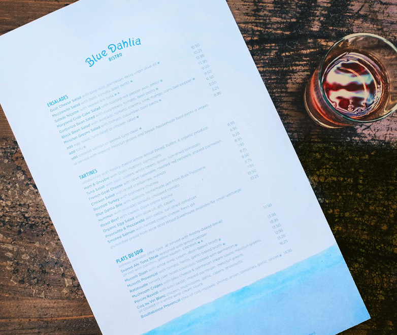
Blue Dahlia
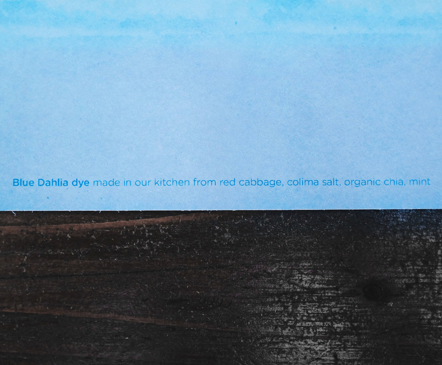
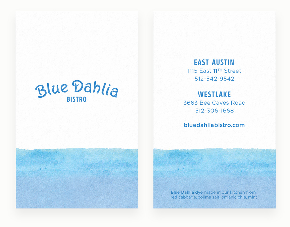
Blue Dahlia Bistro prides itself in preparing simple and sincere food with organic and natural ingredients. We thought they should create their menus in the same way.
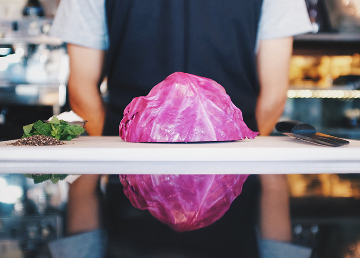
Using ingredients found in their kitchen, we came up with a recipe for a ‘Blue Dahlia dye’ that we could use to print the menus and business cards.
Watch the menu being made in the kitchen:
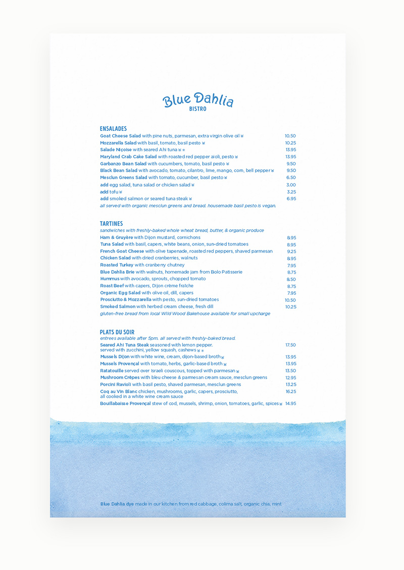
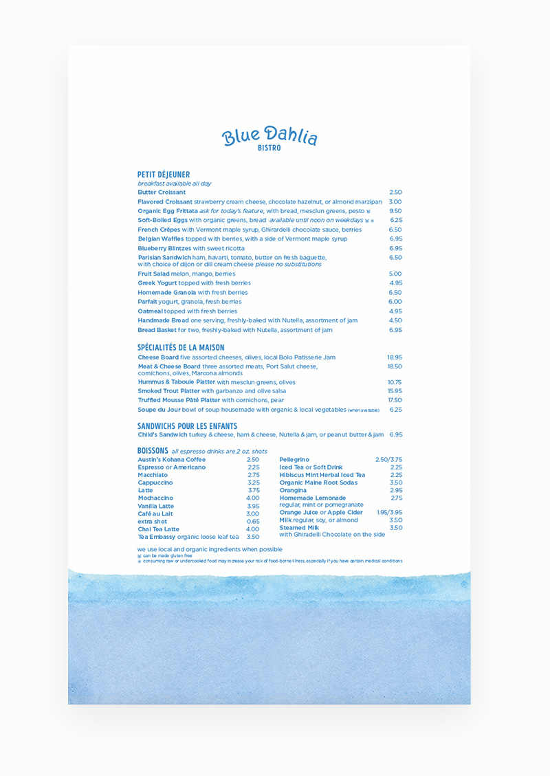
We refreshed their brand behind this concept and created a new logo, business cards, menus, and website.
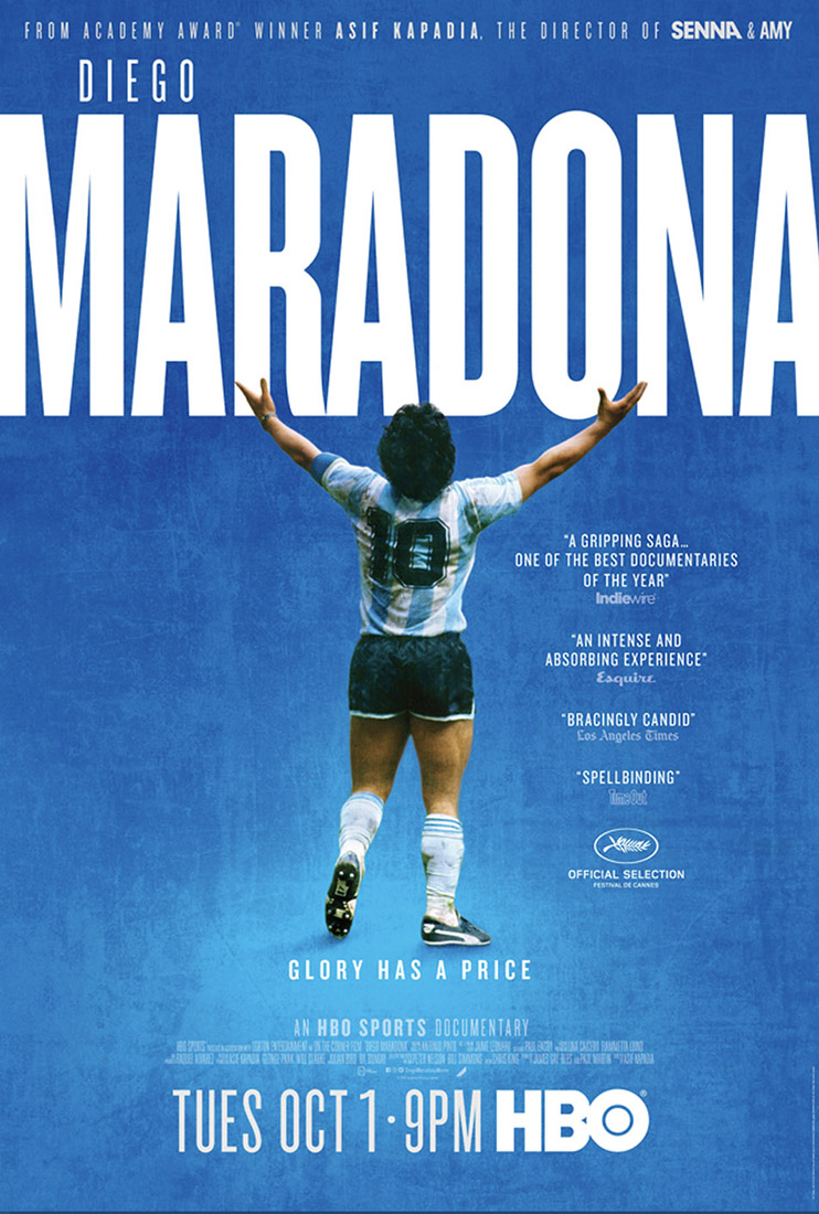
HBO
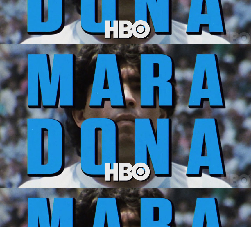
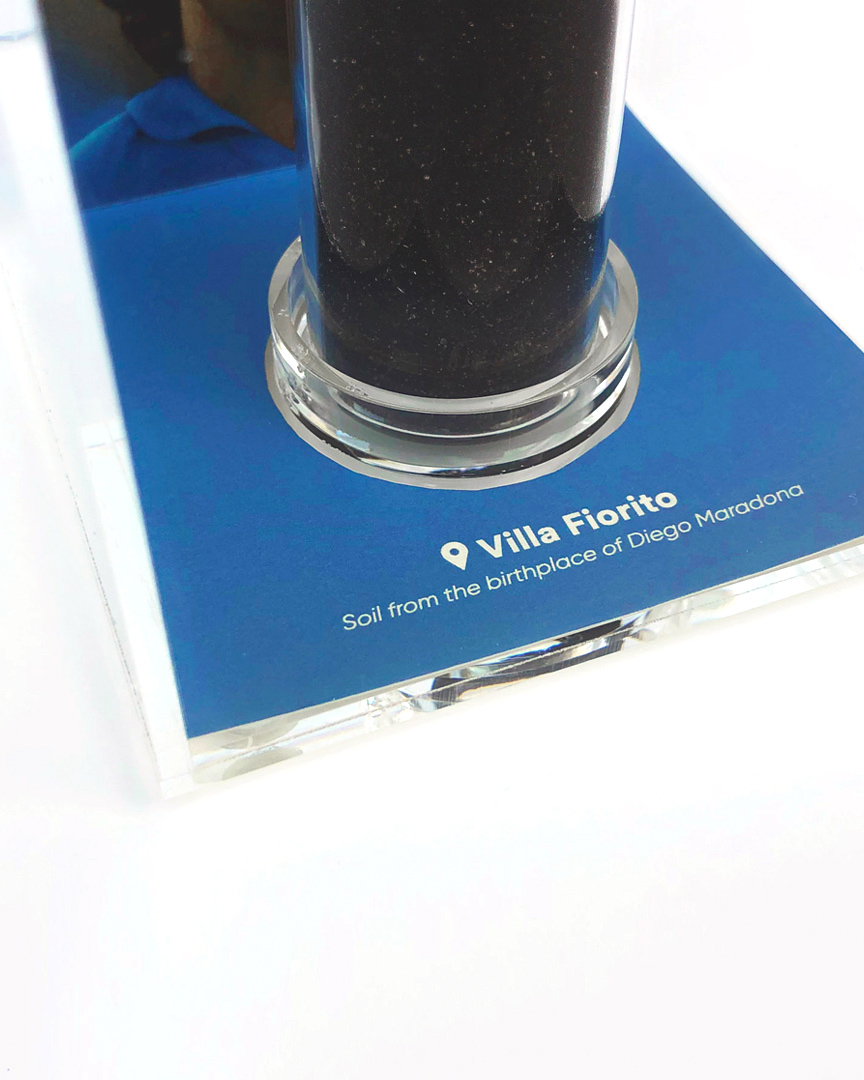
Packaging design for HBO and their highly anticipated feature-length film ‘Diego Maradona’.
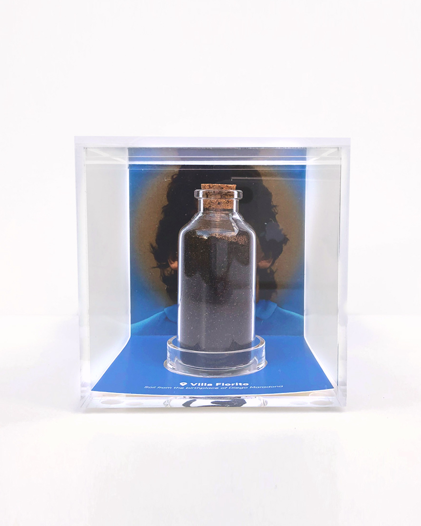
The dirt from Maradona’s childhood home is encased in this special promo piece.
Watch a video of the dirt being collected in Villa Fiorito, Argentina.
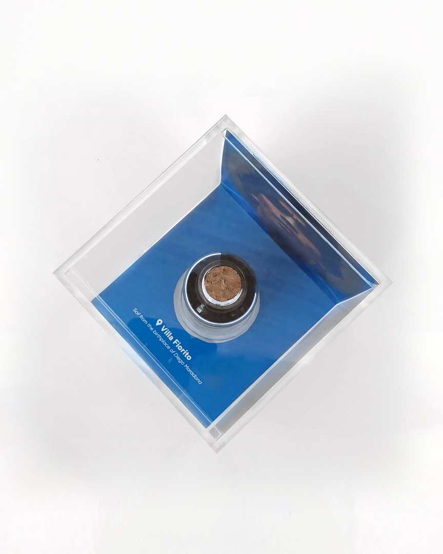
This cube holds a part of where it all began, and the rest of the energetic story can be seen exclusively on HBO.

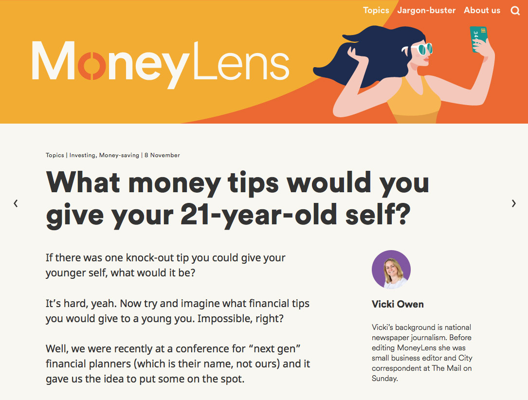
A financial-advice platform targeting millennials needed to create a brand that could cut through the complexities of the topic.
We drew custom illustrations to express our concepts, and developed a website with an uncluttered and friendly layout to publish their articles.
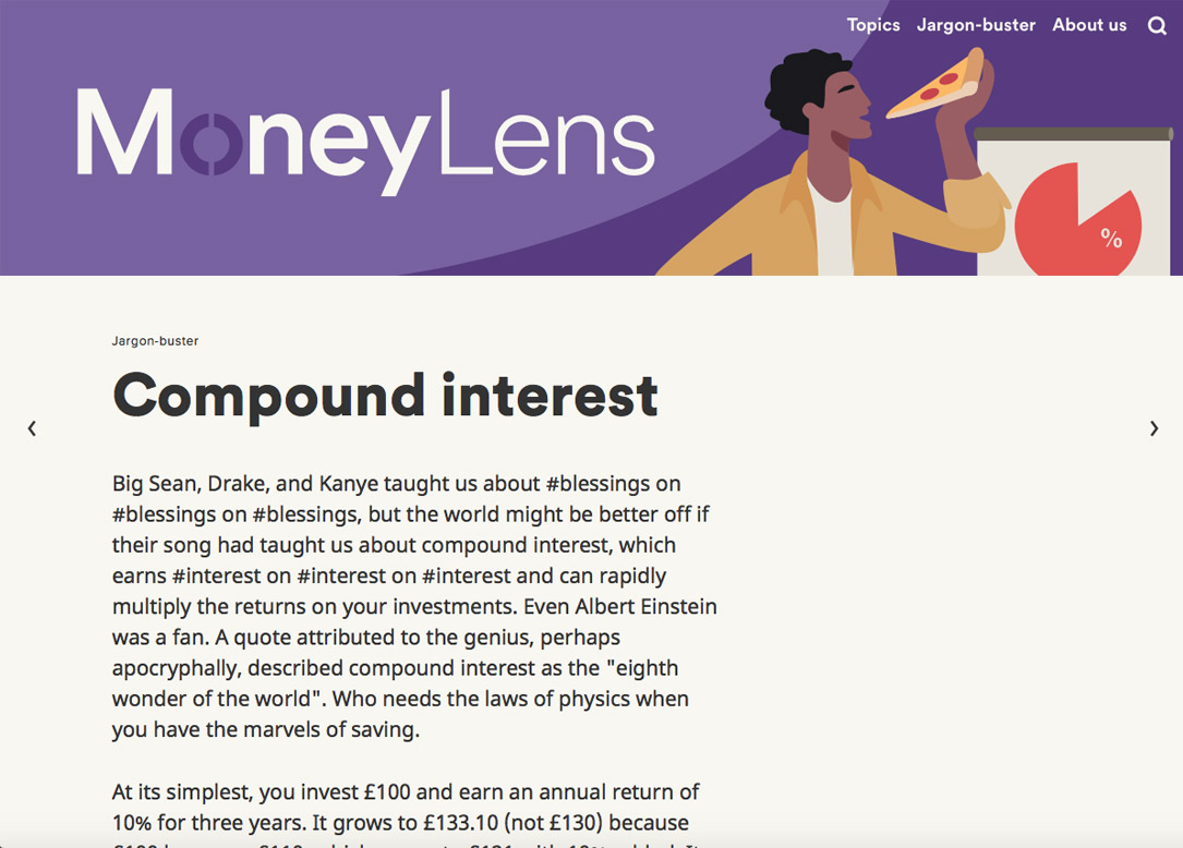
After launching in the UK, we also developed a U.S. version of the site and created a teaser marketing campaign.


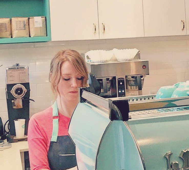
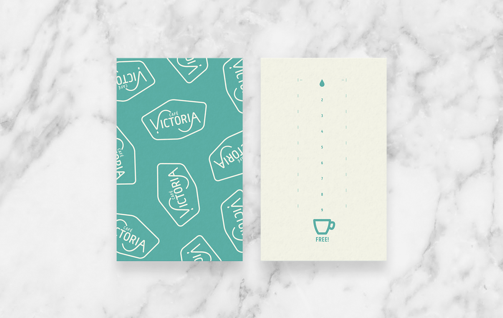
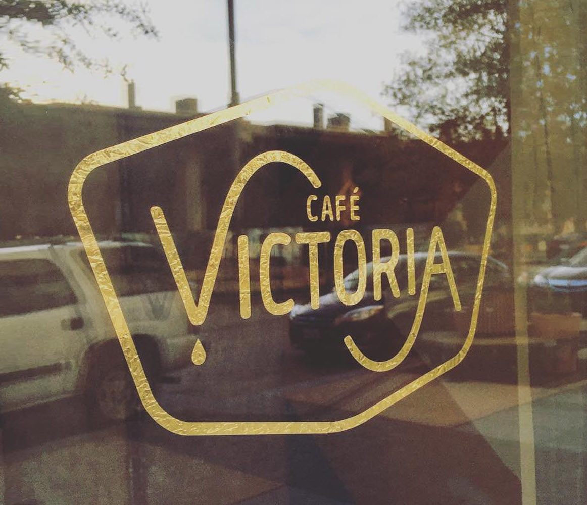
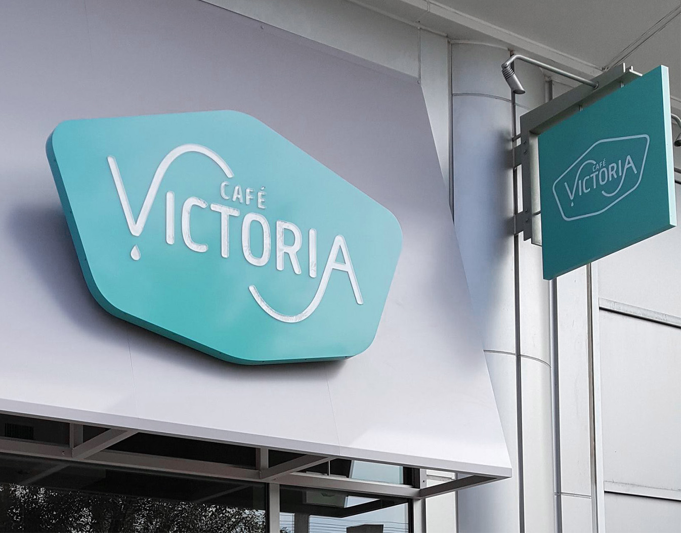
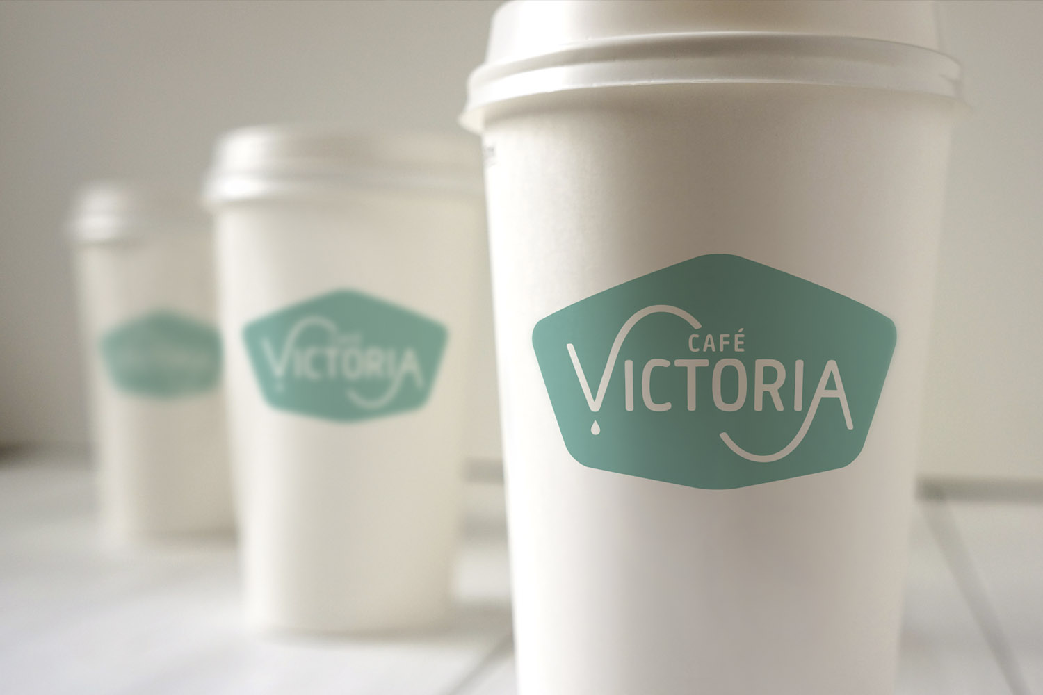
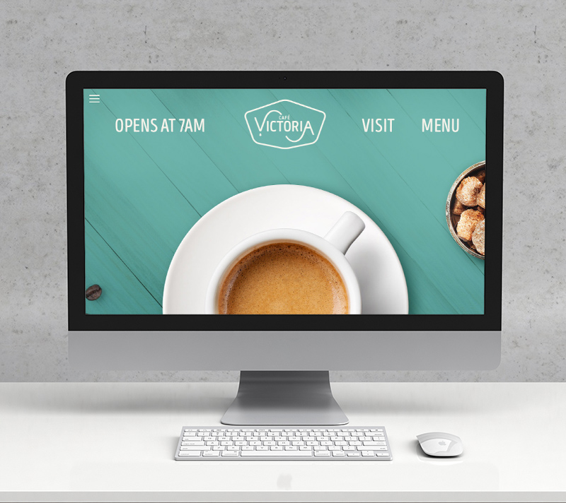
Café Victoria
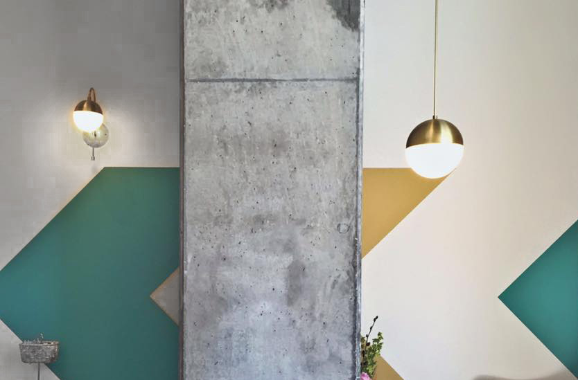
Café Victoria is an idea born and raised in the Victory Park neighborhood of Dallas. We were able to develop the branding from scratch, months before the lease for the shop was even signed, and worked simultaneously with the architect to infuse the brand into the interior design.
The café was quickly named ‘Best Coffeehouse in Dallas’ less than a year after opening.
Café Victoria featured on a local CBS station:
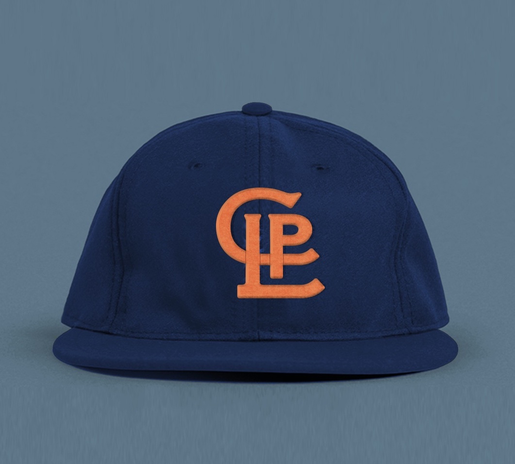
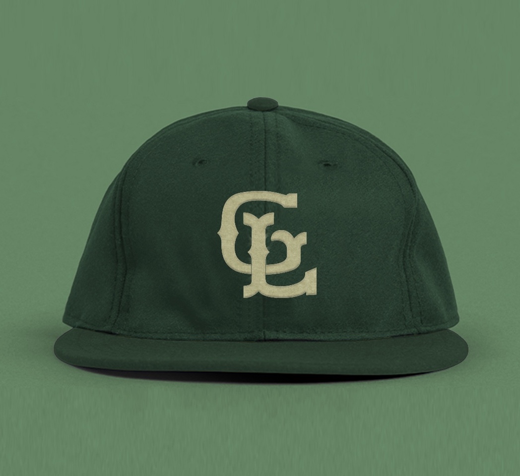

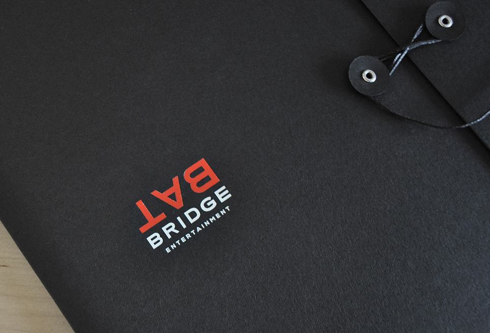
Bat Bridge
An industry veteran was launching a new production company in Austin, and was requesting proposals from different designers for a logo for the name he had chosen.
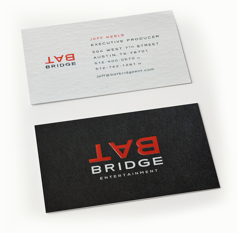
This simple concept immediately won and together we developed a suite of quality branding material to help make a good first impression when meeting with different television networks and film studios.
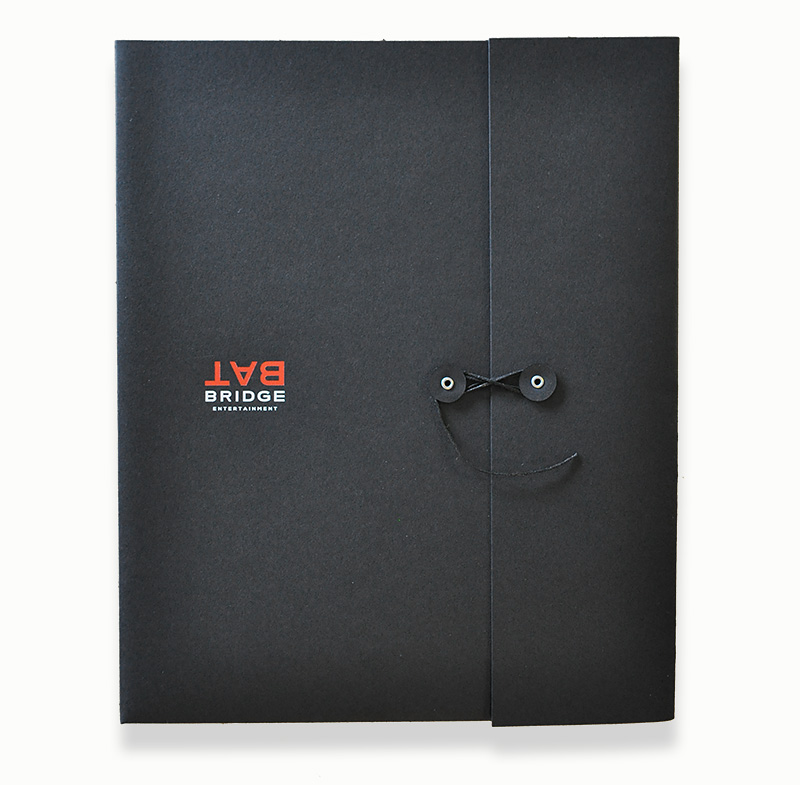
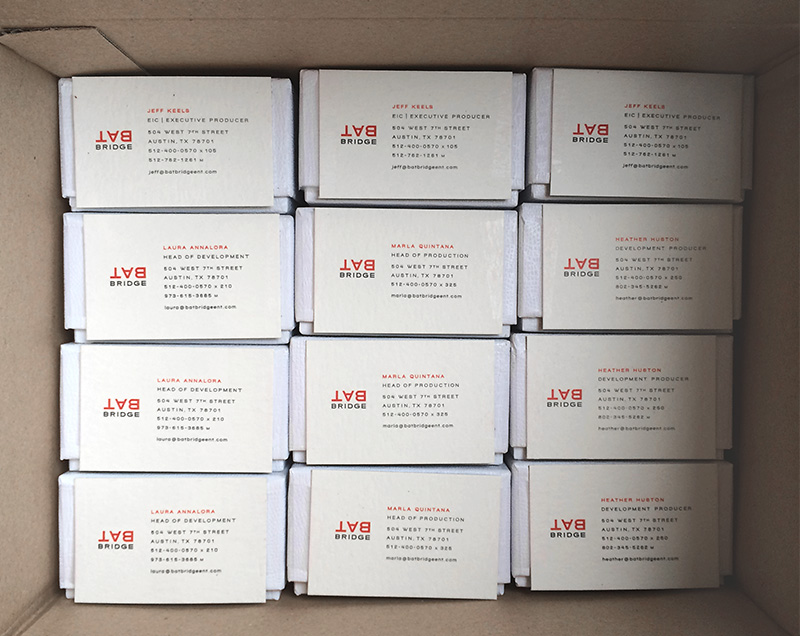
In an age of easy digital printing, we employed traditional printing techniques and special papers to create premium cards, presentation folders, etc.
Very soon afterwards Bat Bridge was producing movies and a hit show for CNN.

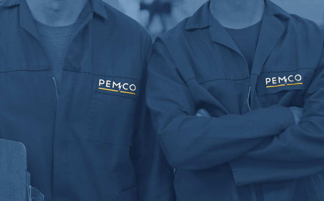
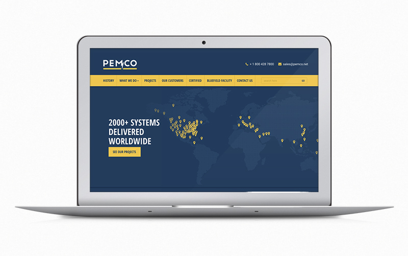
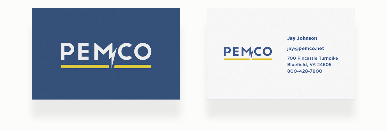
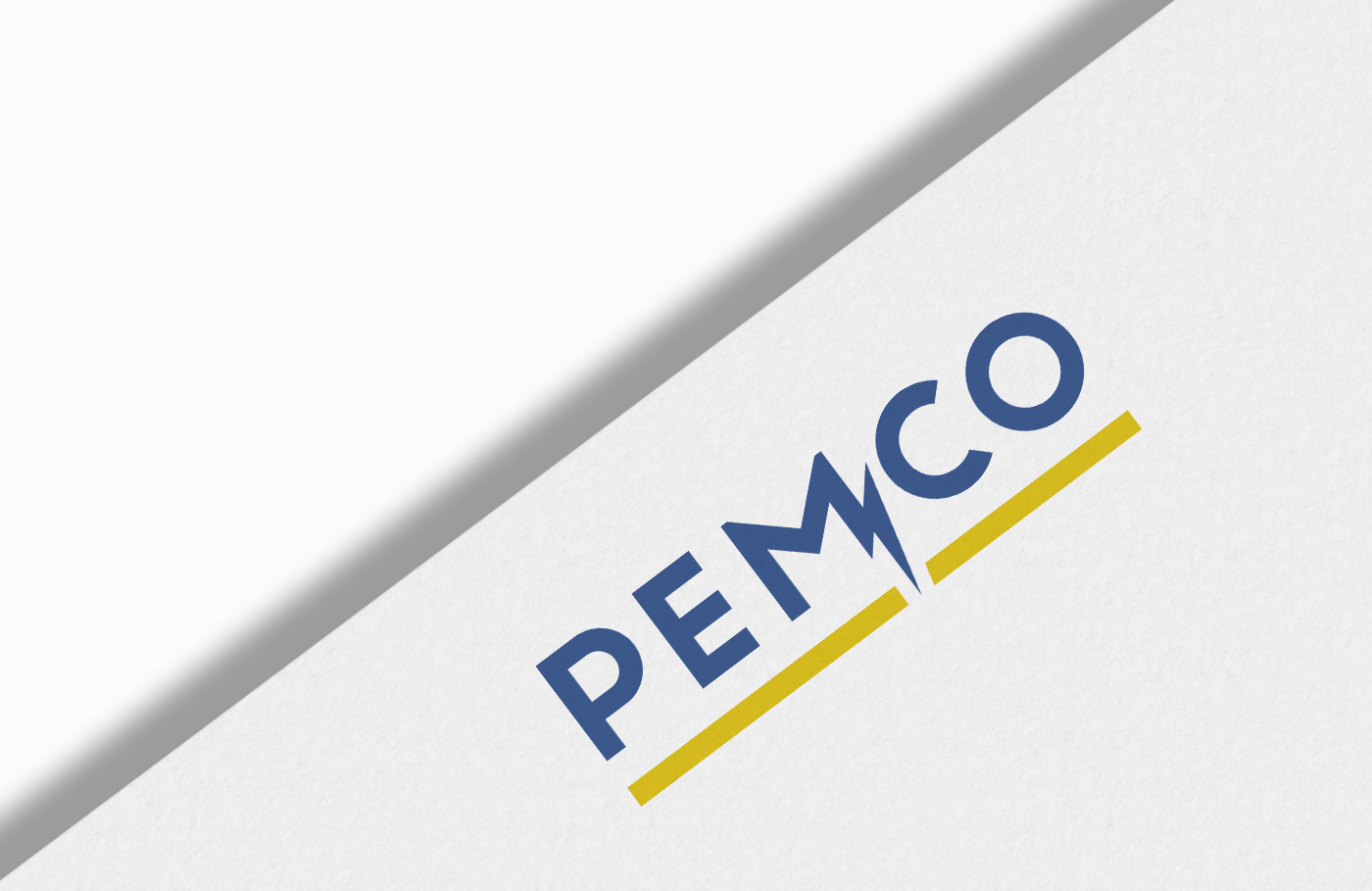
Pemco
A 50-year-old electrical energy company, responsible for powering thousands of projects around the world for systems like the LA Metro, needed a branding refresh.
We designed a new logo and website to give them a modern competitive advantage while still claiming their roots in the industry.
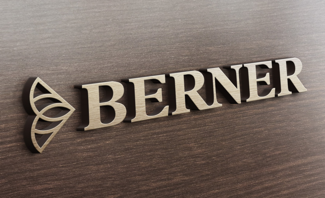
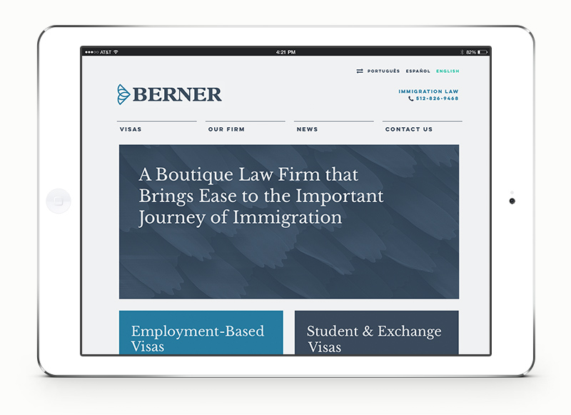
Berner Law
‘Immigration’ is a dramatic word. It’s a big endeavor that can bring up uncertainty, anxiety and even fear.
With an immigration lawyer as a client, we saw a wonderful opportunity to present immigration as something natural, graceful, friendly and easy.
The monarch is the only butterfly known to make a two-way migration. It immigrates from Mexico to Texas, and all throughout the United States every year, returning in the fall.
It gracefully crosses the border, back & forth, often, and with ease.

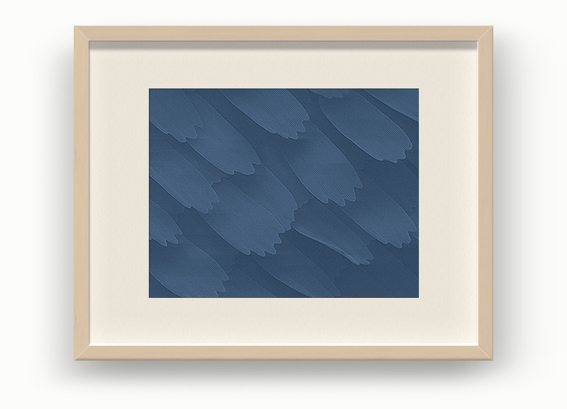
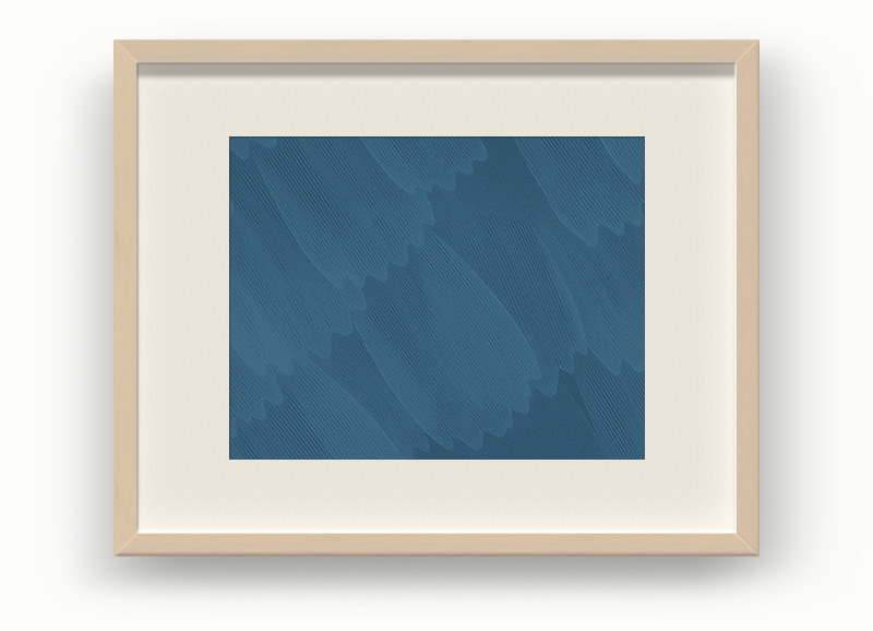
The elegant branding was extended further by using photos of butterfly wings under a microscope as wall art in the law offices.
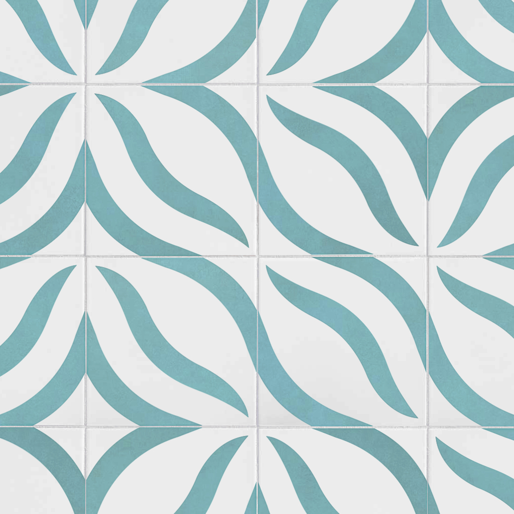
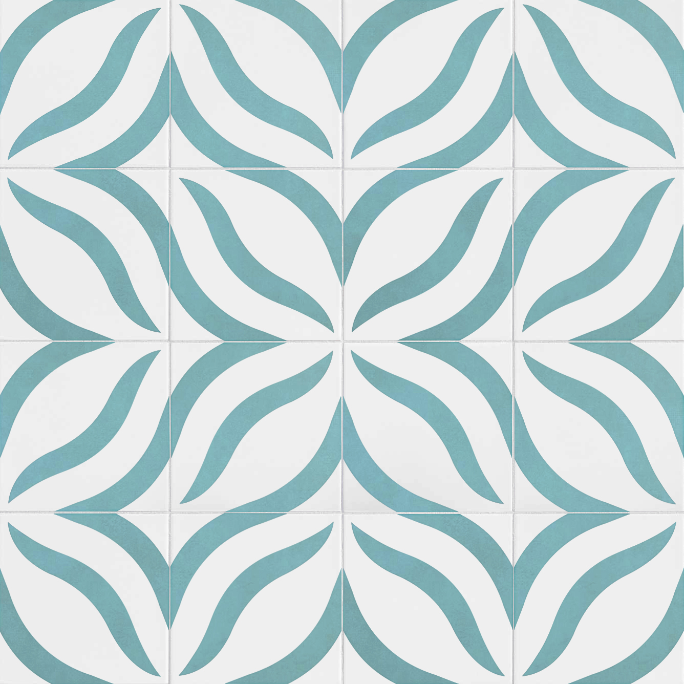
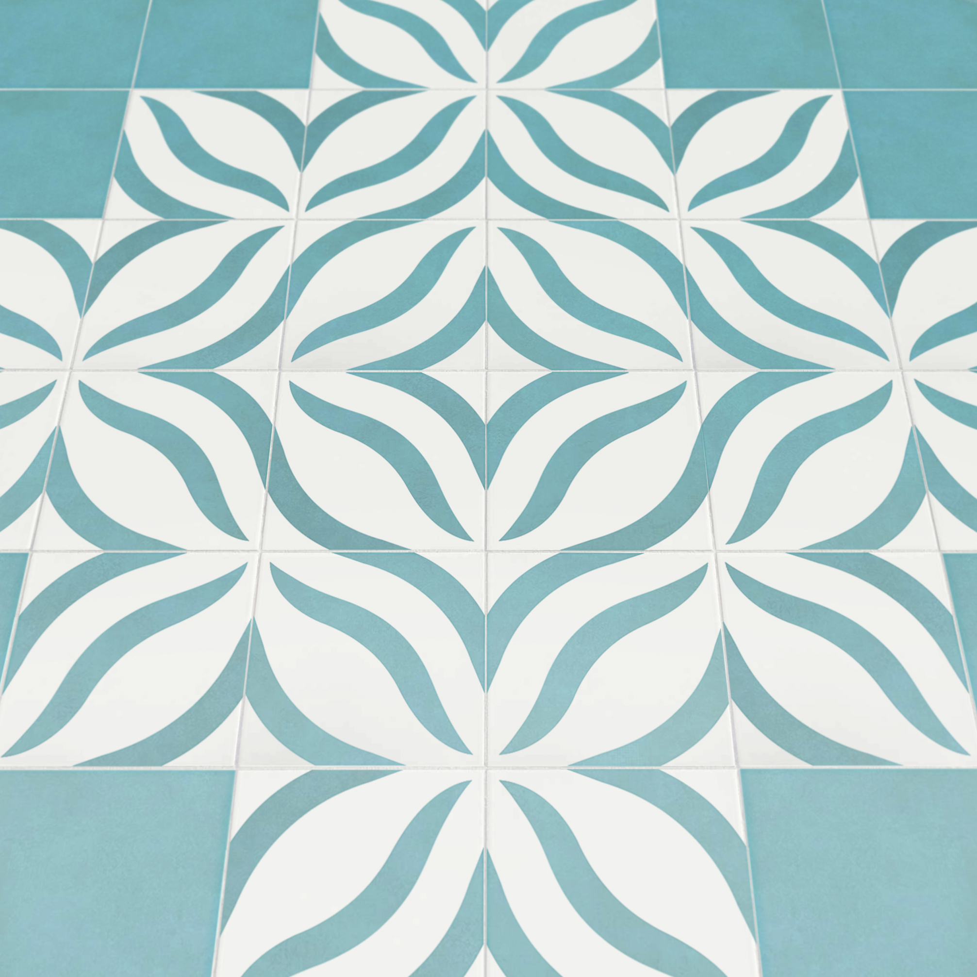
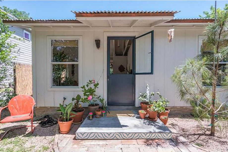
Mosaicos
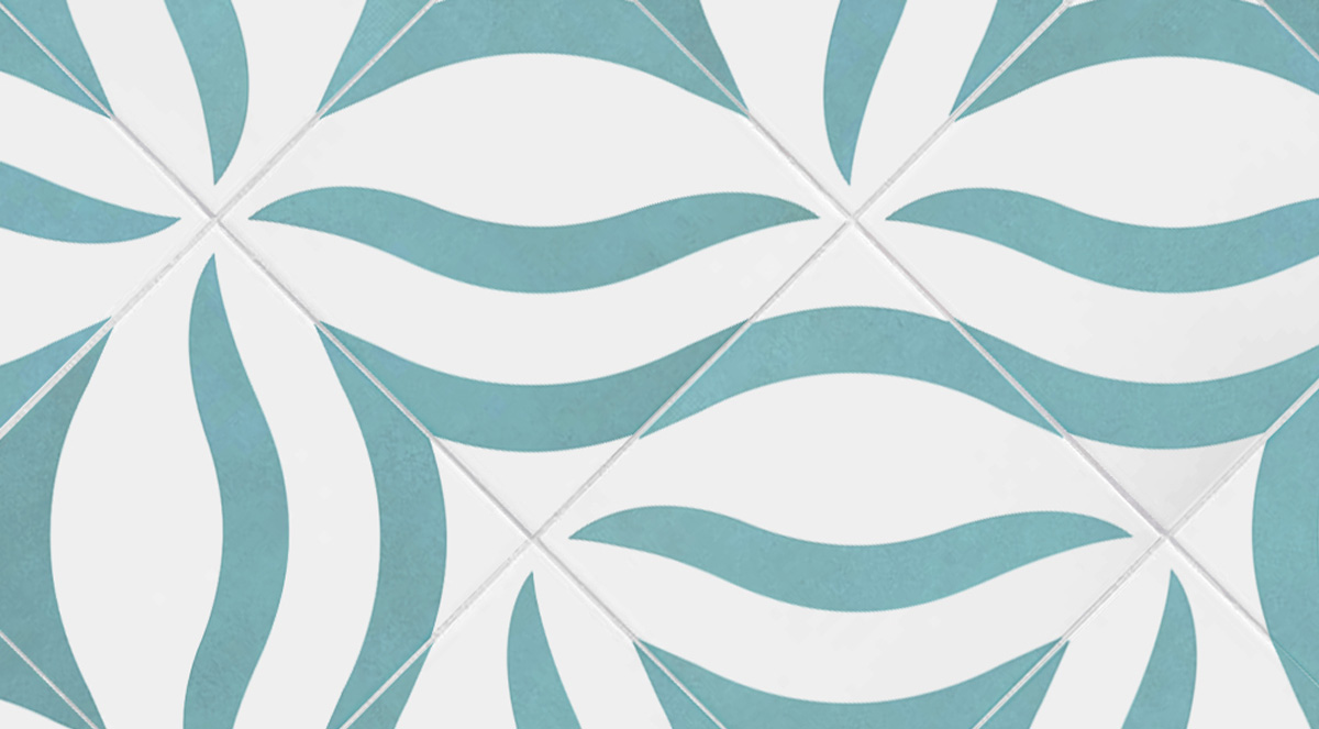
Arte y Decoración has been making Mexican mosaic tiles in Oaxaca for decades – the classic way – with molds instead of printing a thin layer on the surface. To complement their large collection of traditional patterns, they recently began seeking out new artists to add modern designs to their catalog.
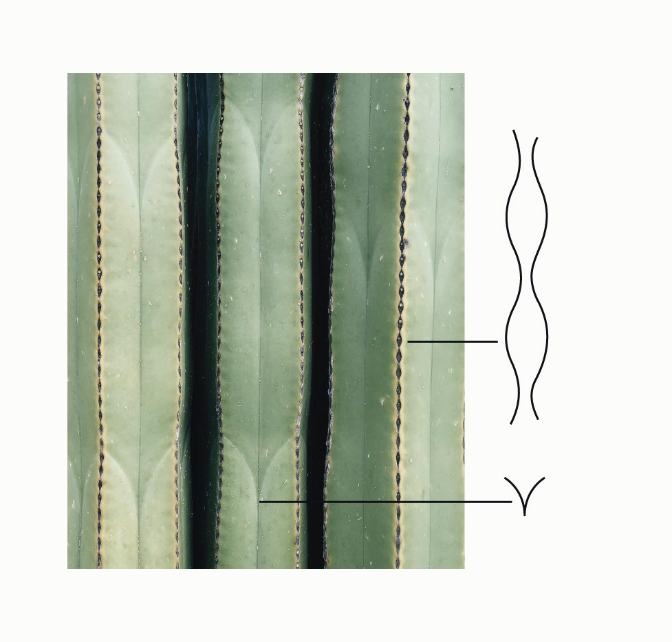

My design was inspired by a trip to Oaxaca’s botanical garden and its organ pipe cactus.
A simple tile that creates many different patterns and combinations.